HOME
Work
Contact
HOME
Work
Contact
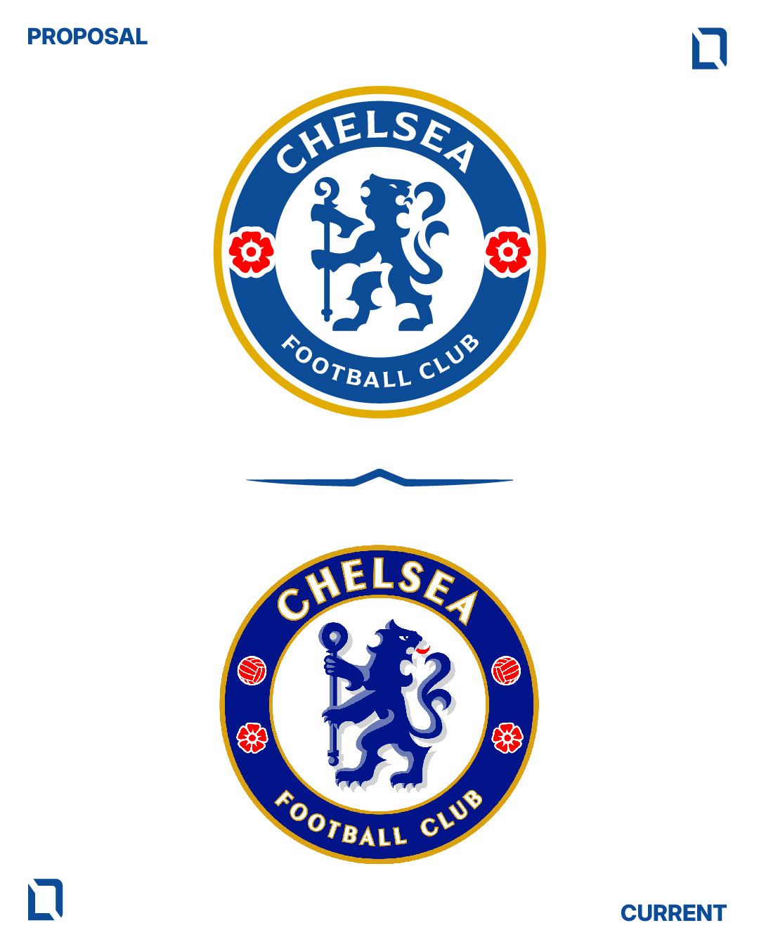
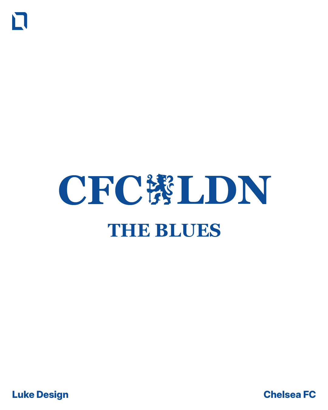
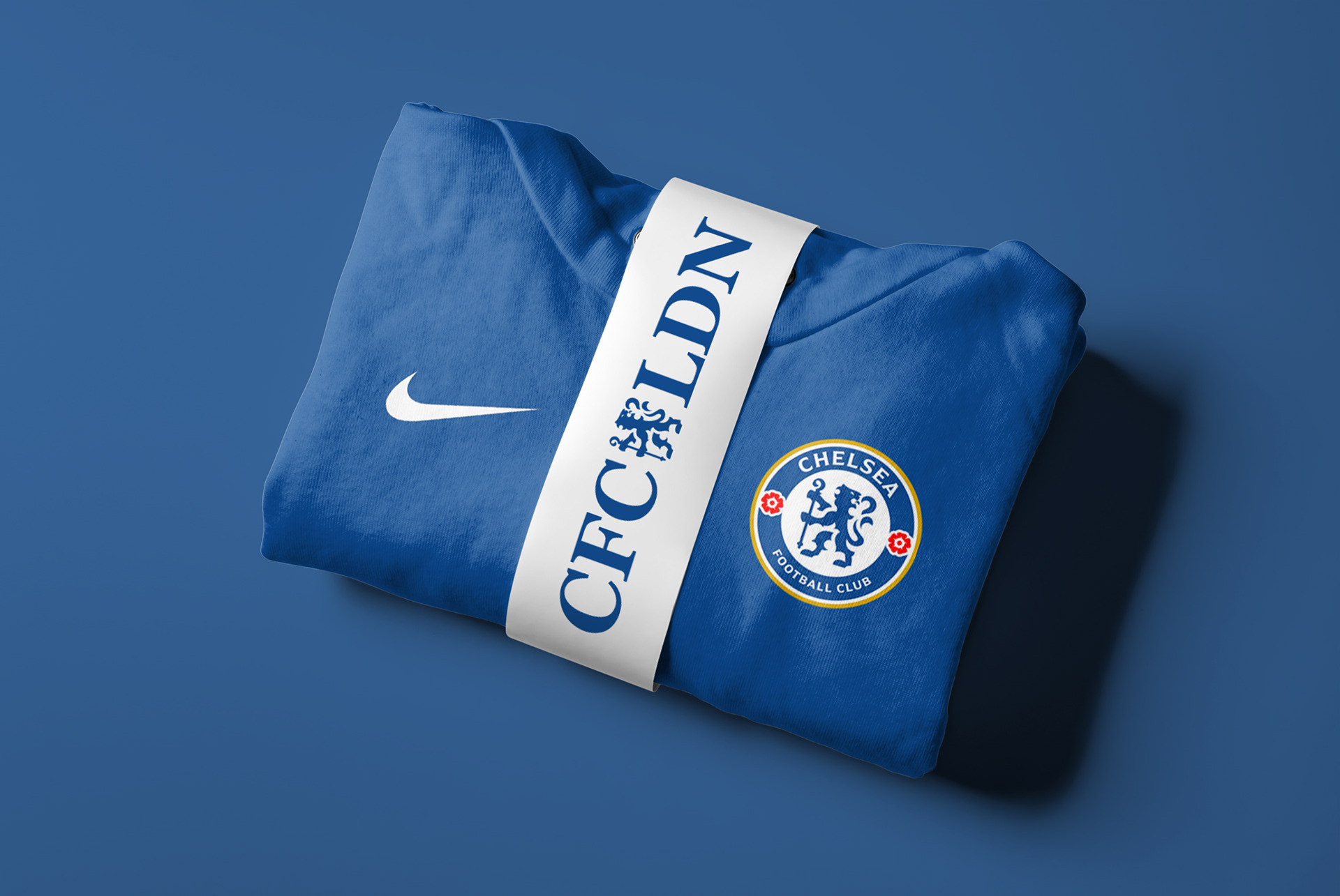
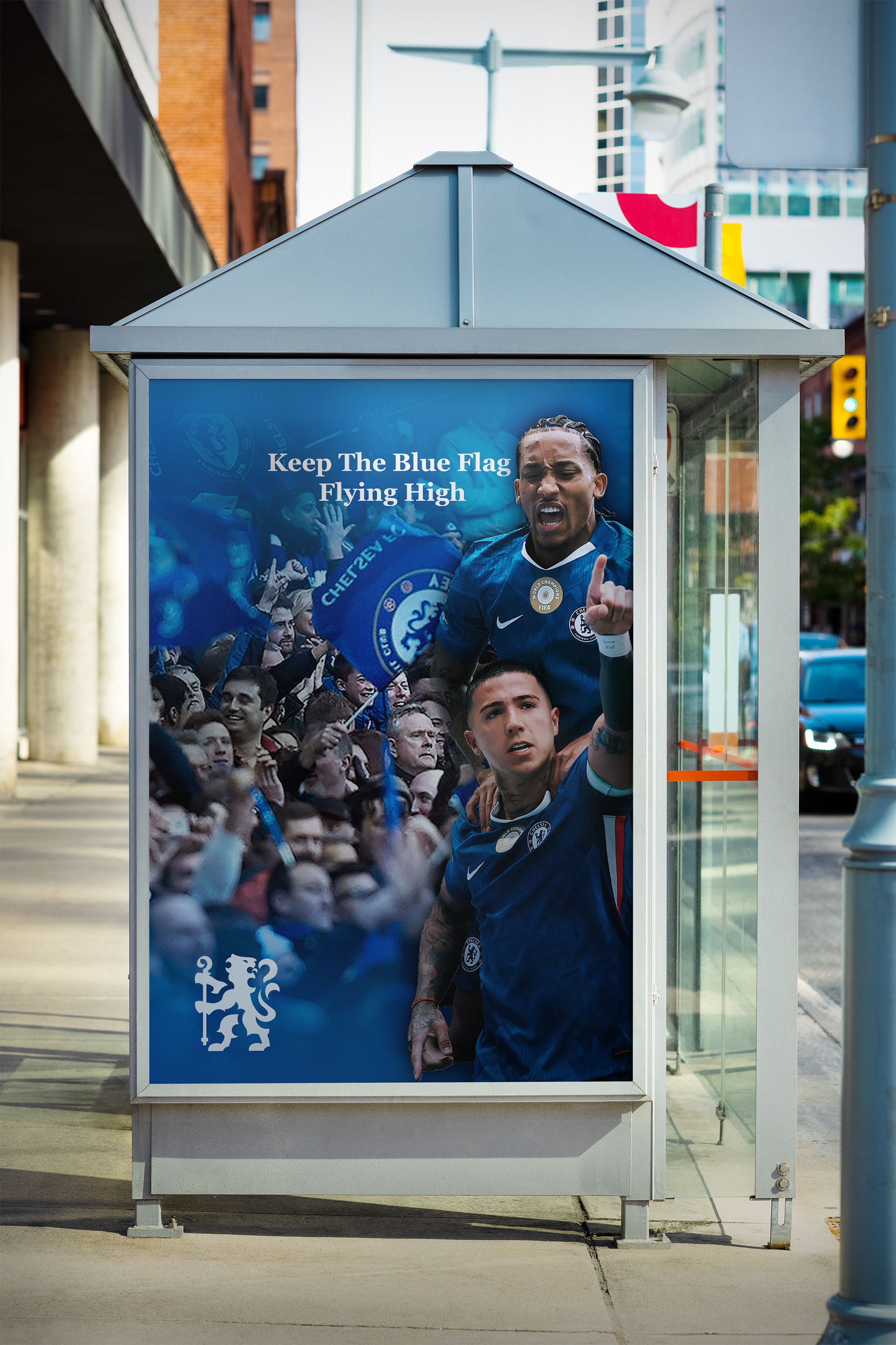
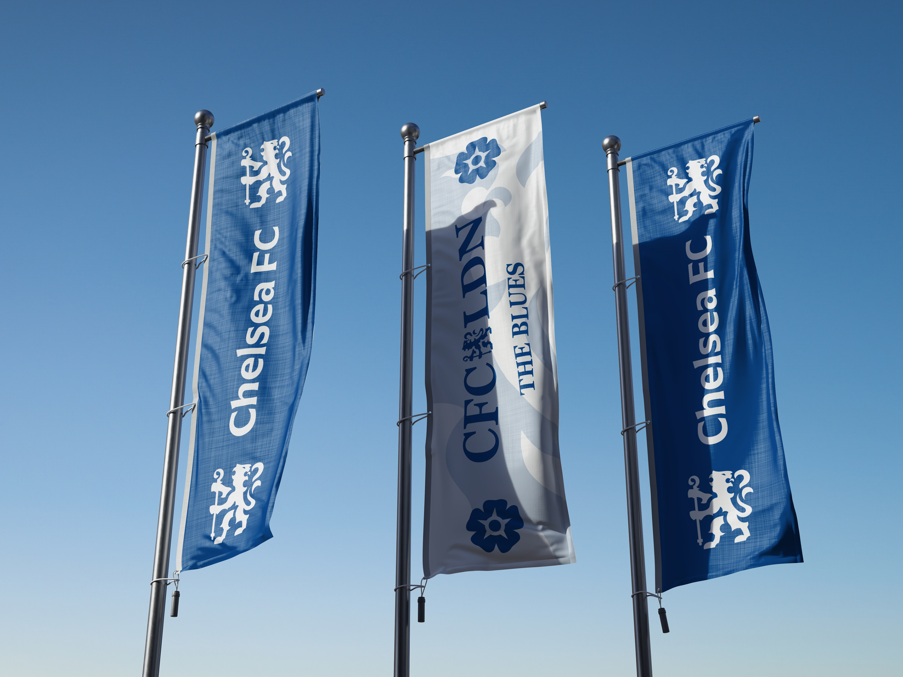
Chelsea FC Rebranding
Personal Project
↑
Back to Top